

GameShift
A rebrand for an ever-evolving consultancy transforming leadership and culture.
GameShift isn’t your typical management consultancy. They’re a dynamic network of curious minds – a vibrant community of diverse individuals with a wide range of skills and specialties. This allows them to tailor the perfect team to address each client’s unique challenges and opportunities.
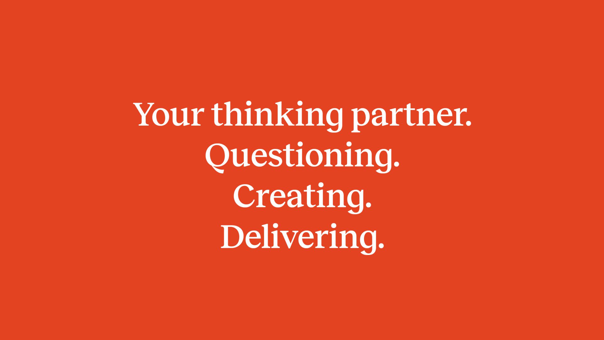
They go beyond simply providing solutions, they become your thinking partners and their approach is multifaceted. They question the status quo, co-create innovative solutions, and deliver impactful results. Ultimately, they believe that by empowering organisations, they can create positive change in the world.
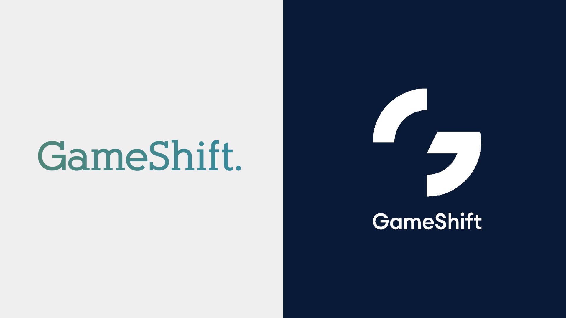
Transforming the mark
As an organisation dedicated to driving change, the goal was twofold, to attract new executive-level clients and to cultivate a talent pool that mirrors their innovative approach.
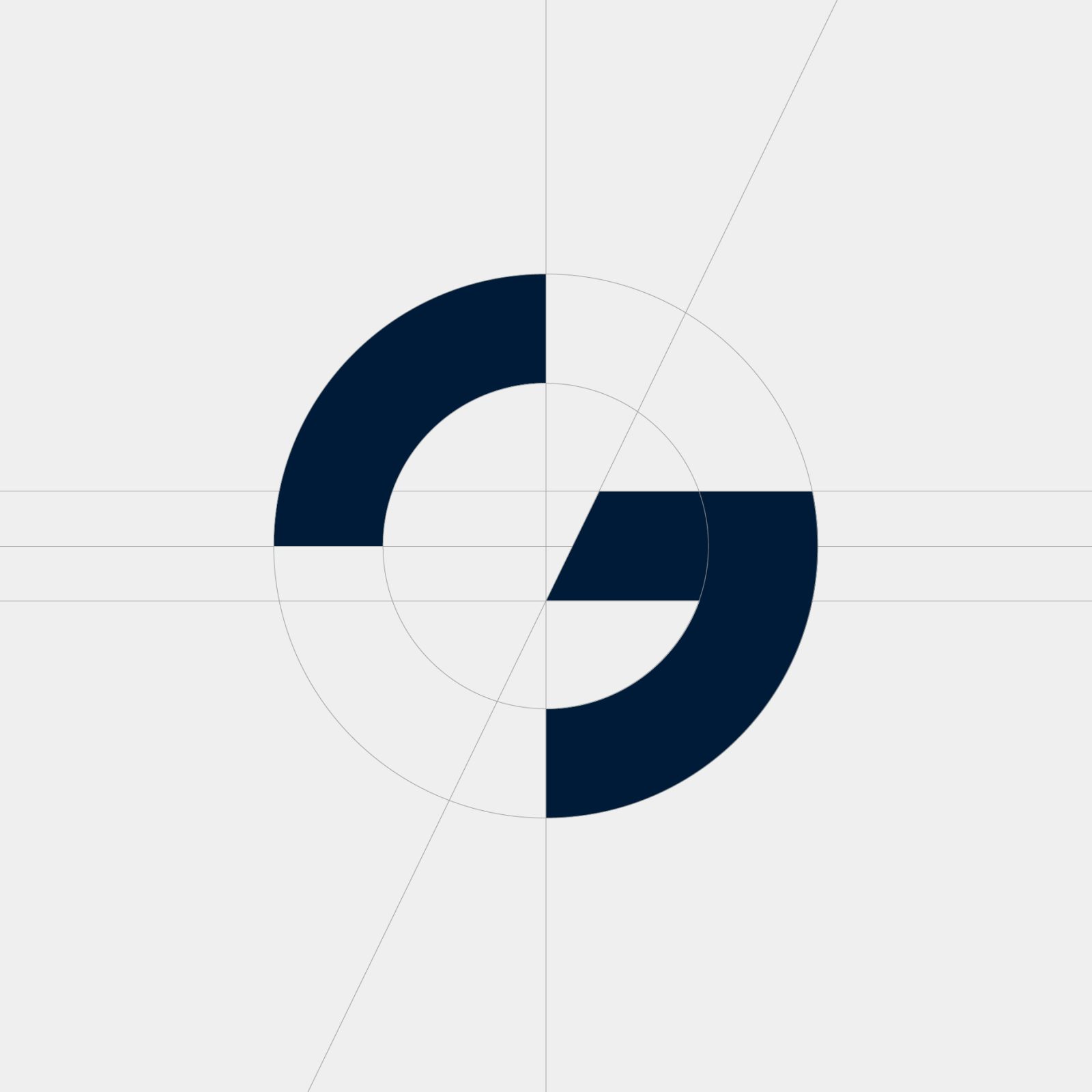
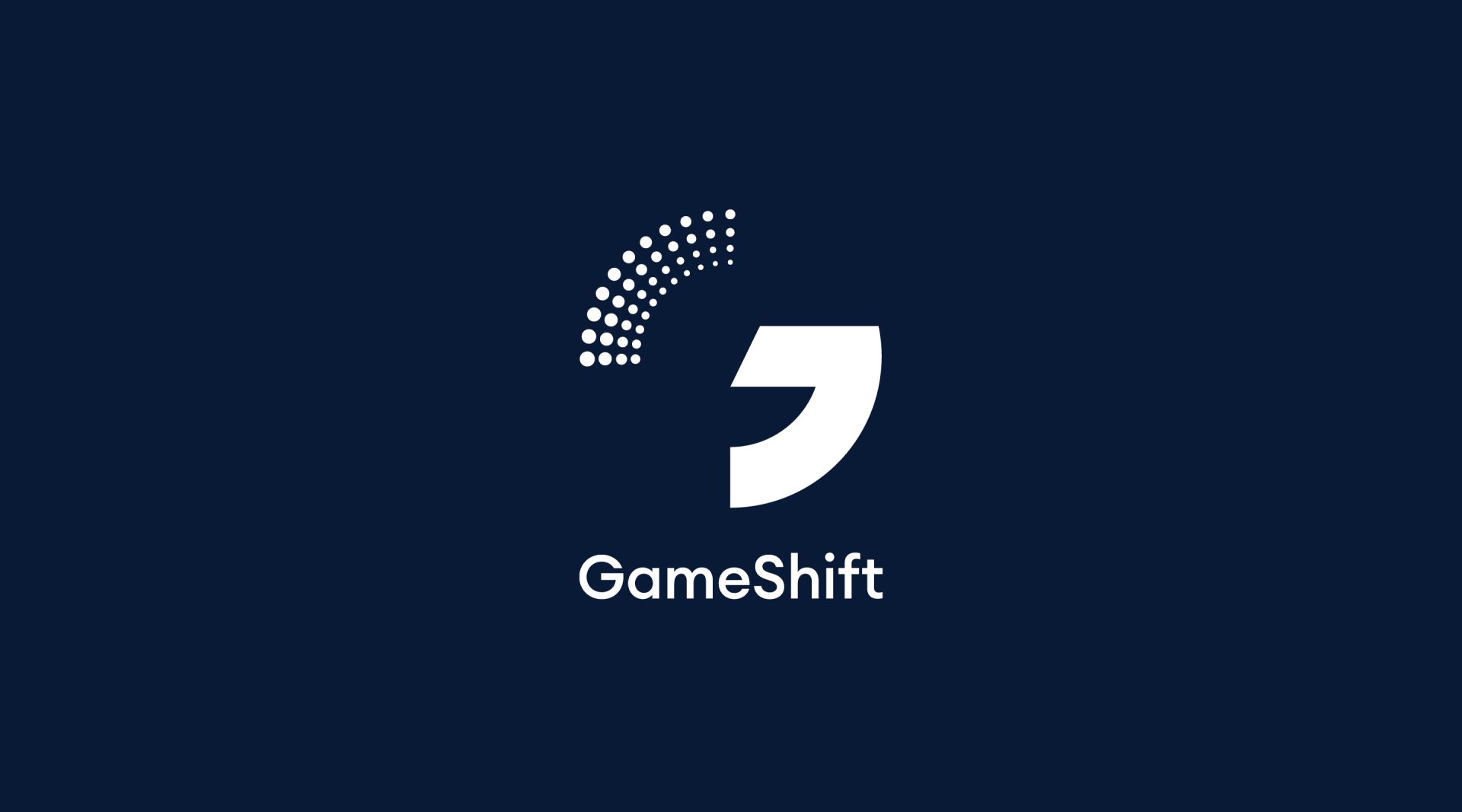
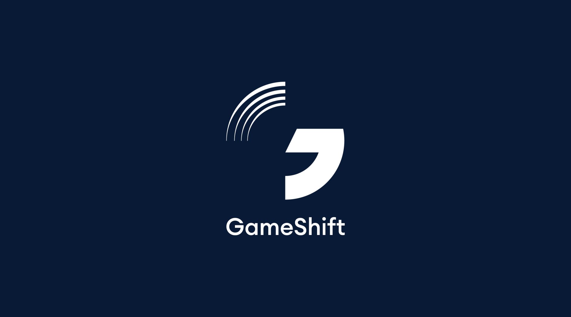
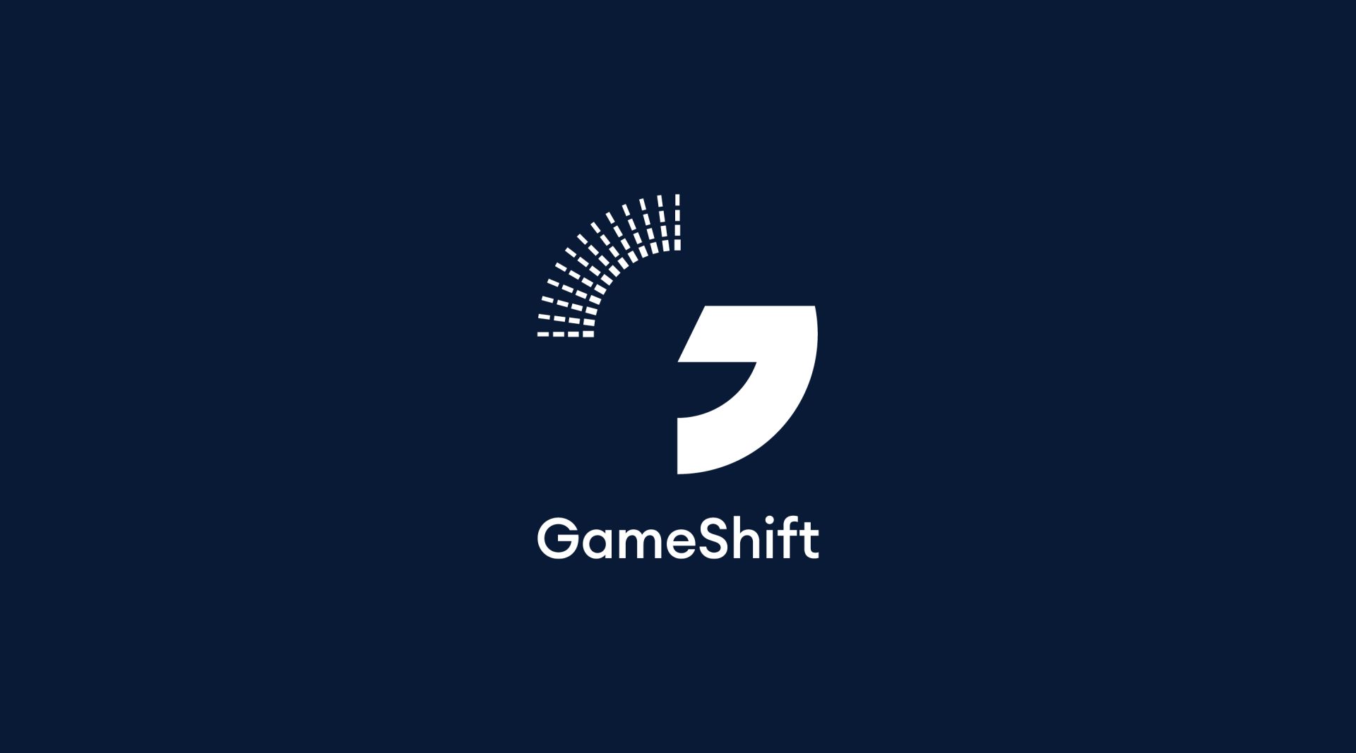
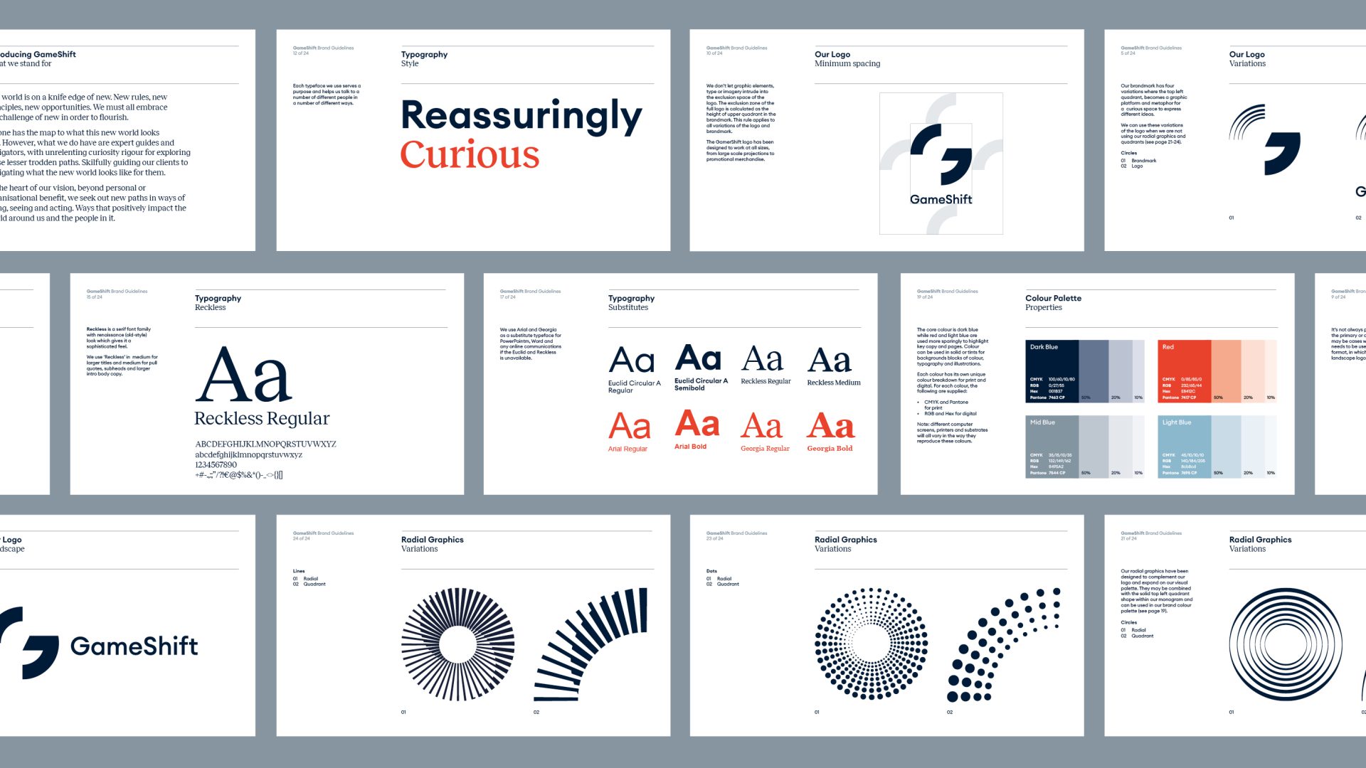
We created a new brand mark that embodies the concept of transformation. It features a dynamic letter ‘G’ mark while subtly hinting to the letter ’S’. The mark forms the foundation for a flexible and comprehensive identity system.
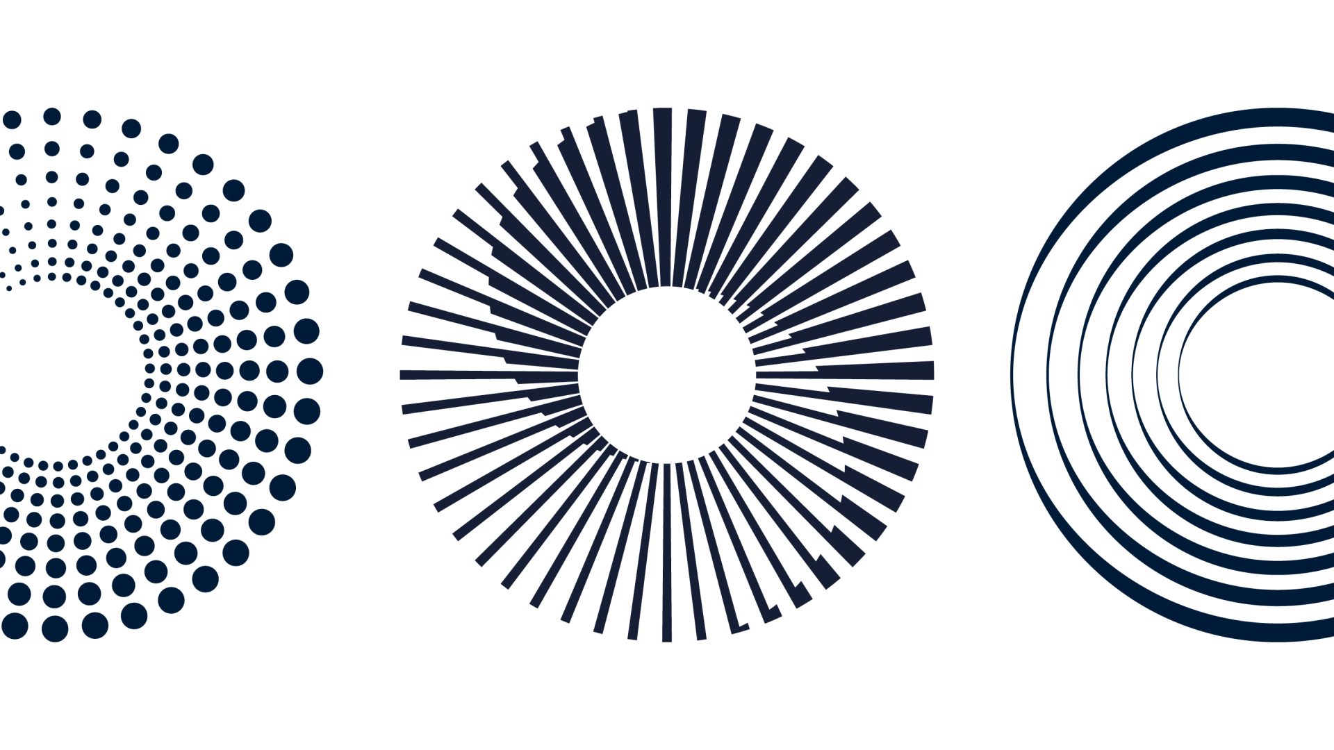
Dynamic by design
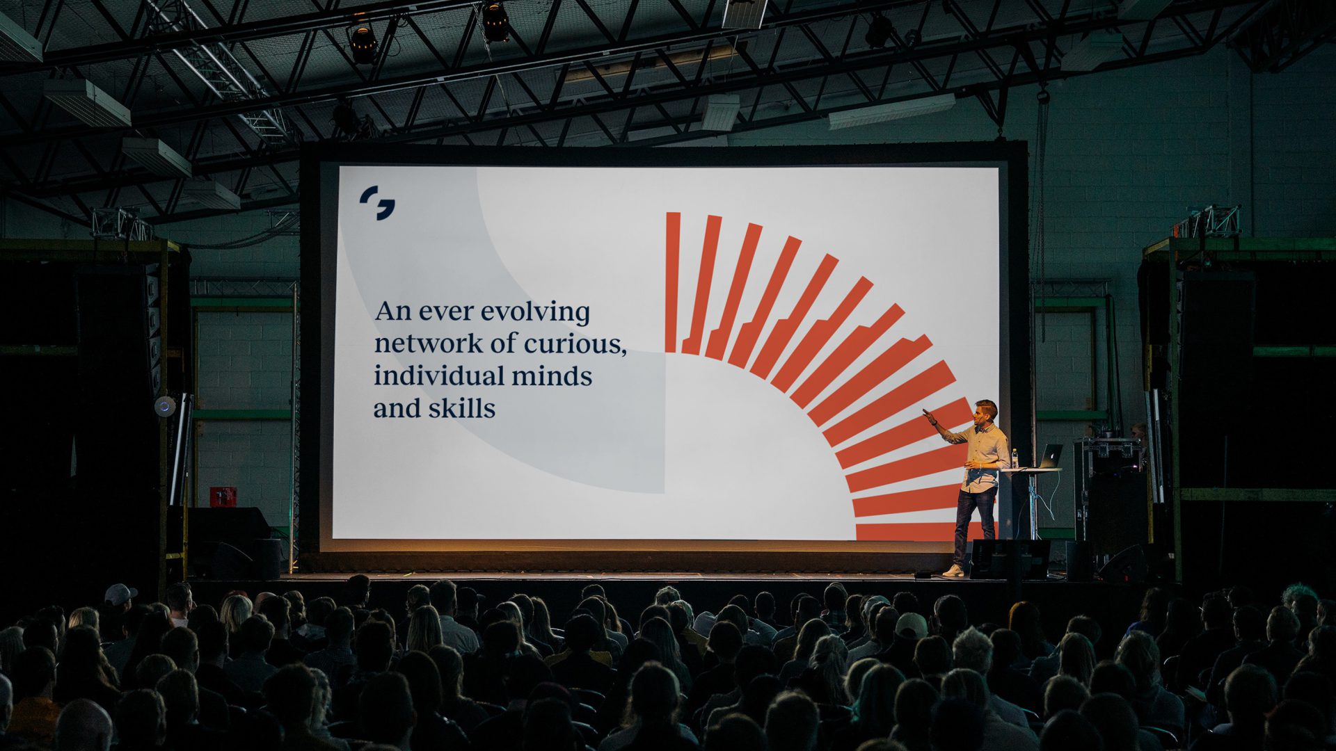
GameShift’s approach is fuelled by unrelenting curiosity, constantly seeking new perspectives to tackle challenges. This concept guided our exploration of a series of geometric radials that reflect the very essence of transformation.
By incorporating the radials back into the brand mark, we created a flexible identity system. This allows for multiple variations of that mirror GameShift’s ever-evolving approach.


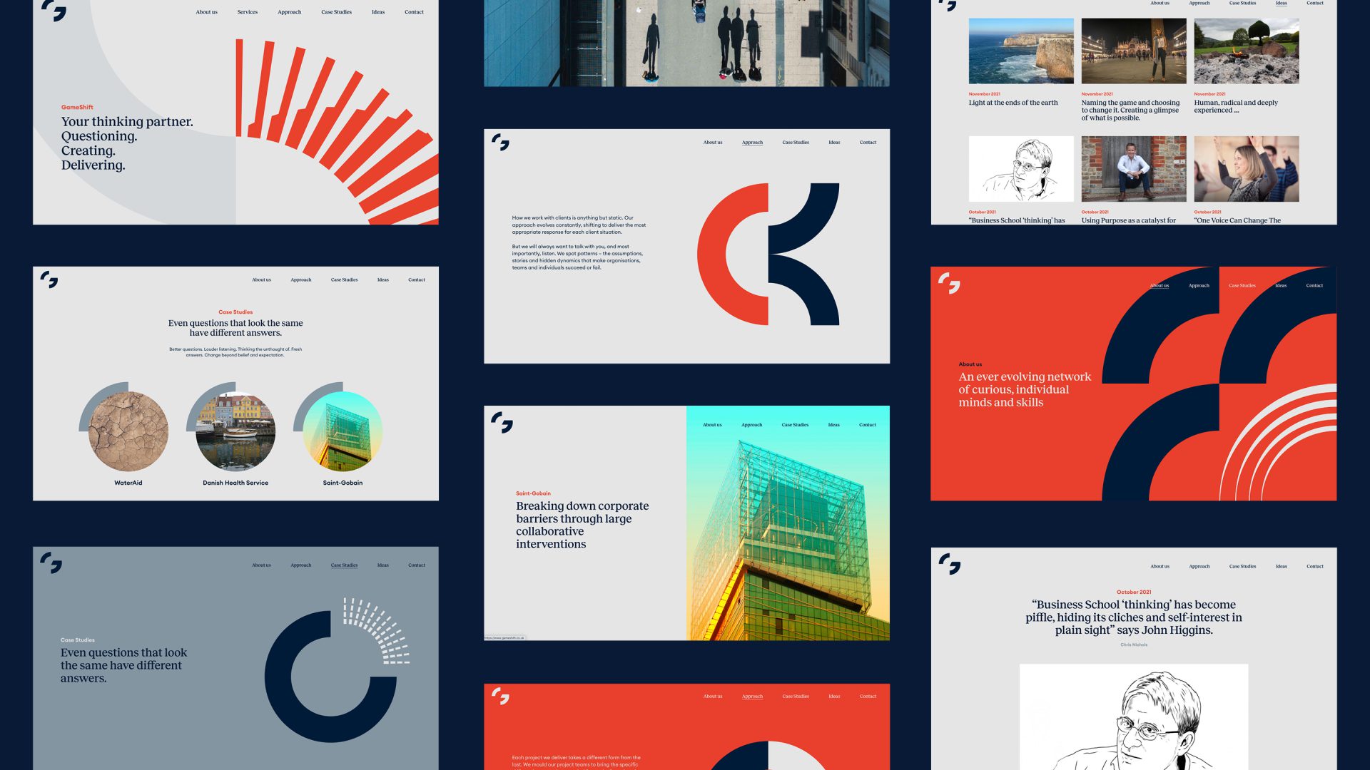
Transformation in action
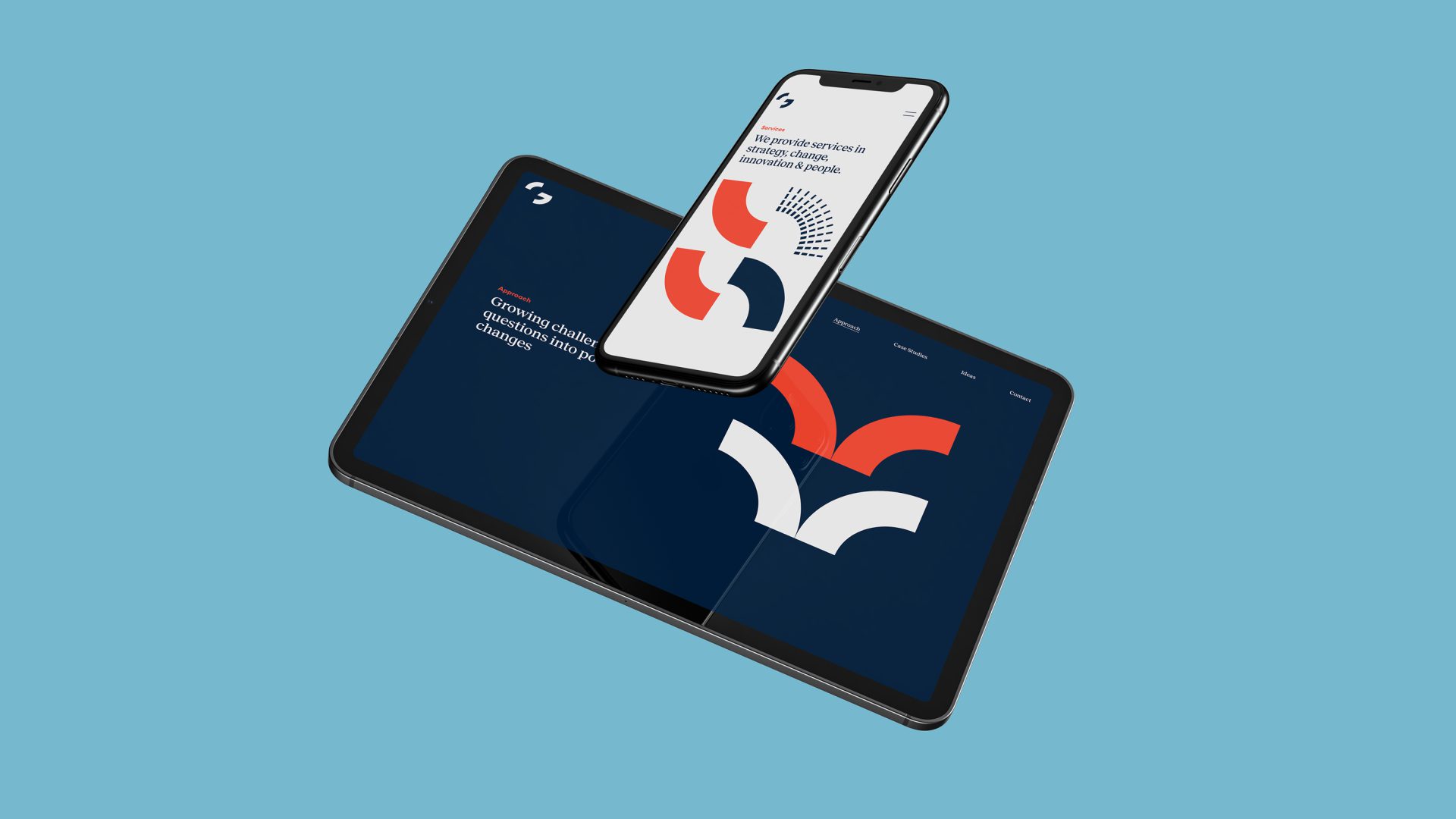
The visual identity extends beyond the logo with a striking image treatment that utilises abstracted elements from the radials to create new and ever-changing combinations. The identity seamlessly integrates across the website, bringing their unique approach to life.
See the website here
Empowering expertise
The primary typeface leverages a modern serif font, a choice that reinforces their expertise and experience while maintaining a warm and approachable feel.
The colour palette is a thoughtful blend of sophisticated blues and neutrals that exude confidence, while a vibrant, modern red injects a welcome dose of energy, creating a modern and elegant scheme.
A toolkit for brand expression
The brand guidelines enable a powerful and consistent brand experience, ensuring everything, from logo usage to voice and tone, reflects the brand identity consistently.


Ready to transform your brand?
Book a 15 minute discovery call with us and see how we can help you.
→