
Cohese Healthcare
A collaborative, human-centred brand driving better patient outcomes.
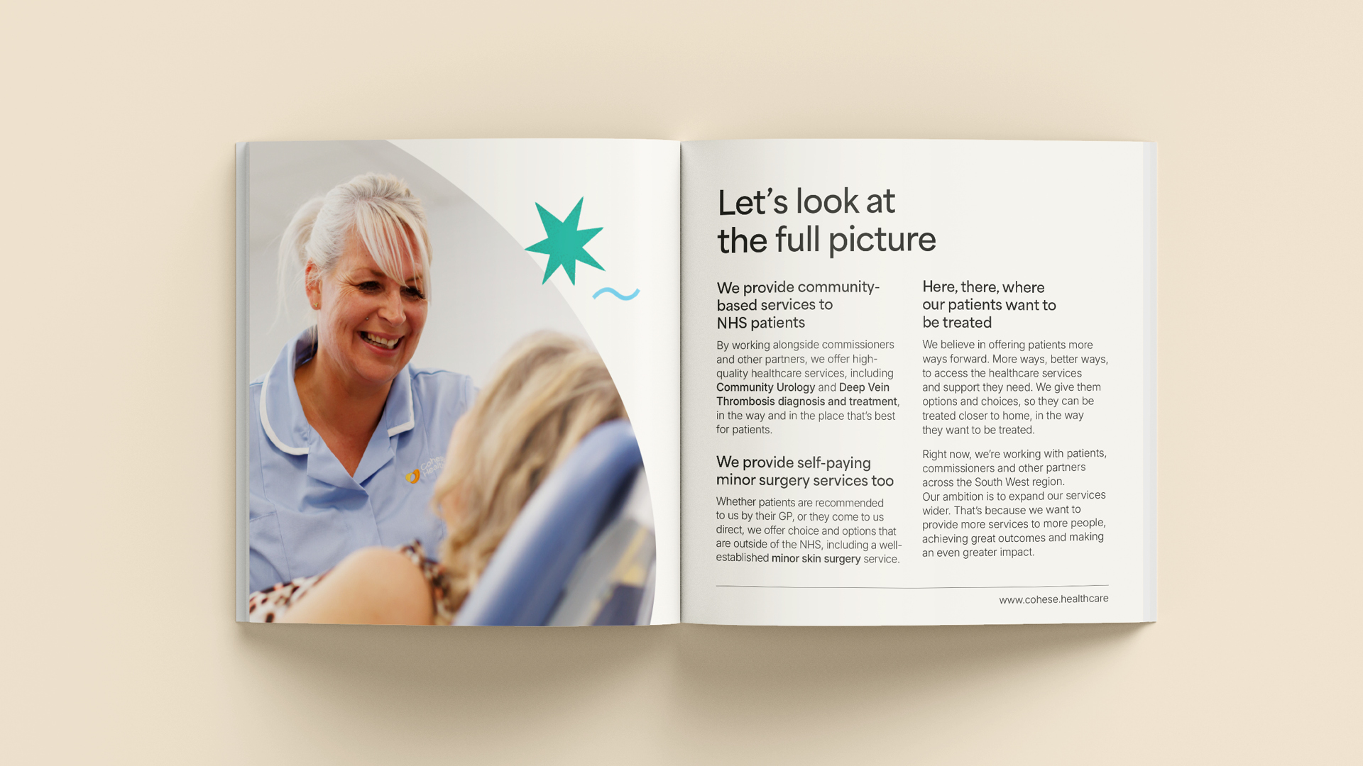
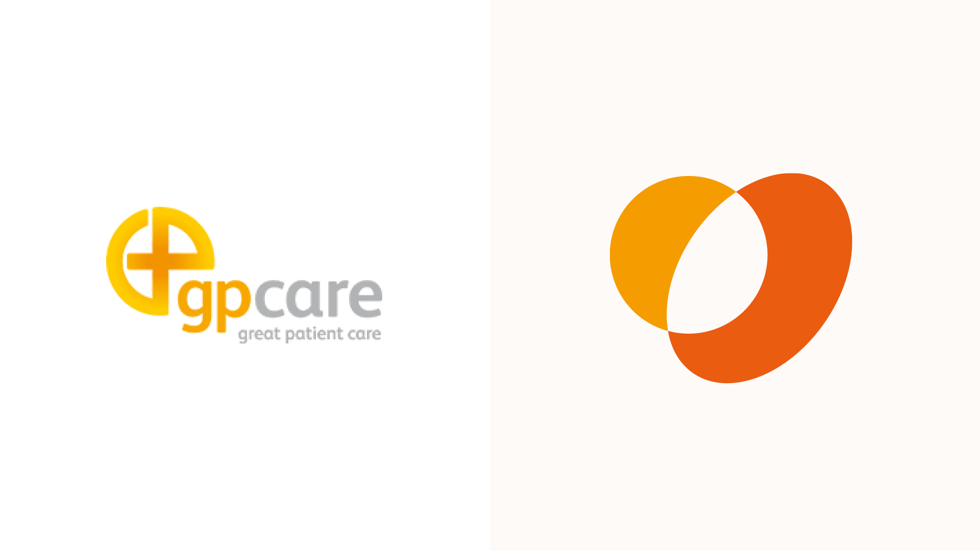
Formerly known as GP Care, Cohese Healthcare has provided high-quality, community-based NHS services and self-pay minor surgery for over 20 years. Engagement with patients, partners, and staff revealed that the name no longer reflected their purpose or direction, creating confusion about their role.
The challenge was to reposition their brand to communicate with clarity, confidence and connection, capturing the organisation’s human approach and positioning them for greater impact and future growth.
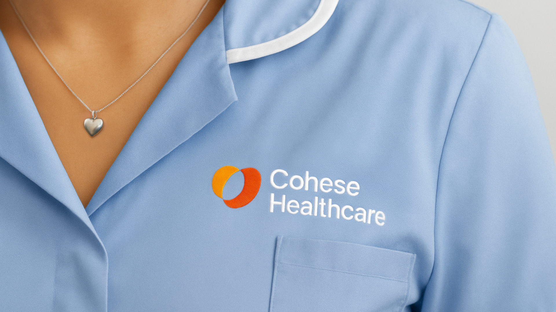
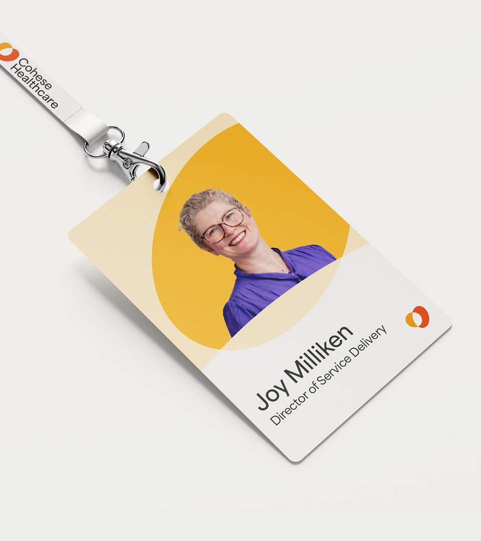
New name and brand mark for cohesive healthcare
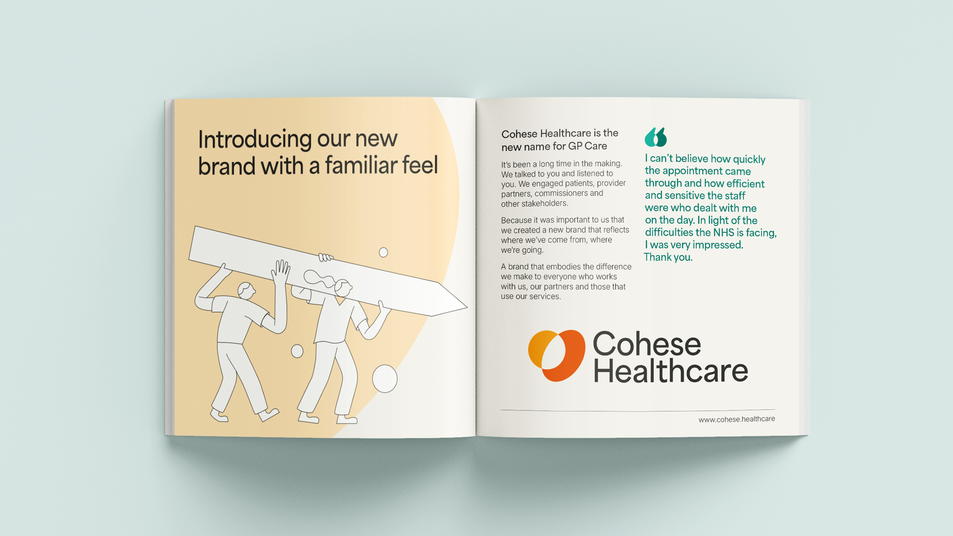
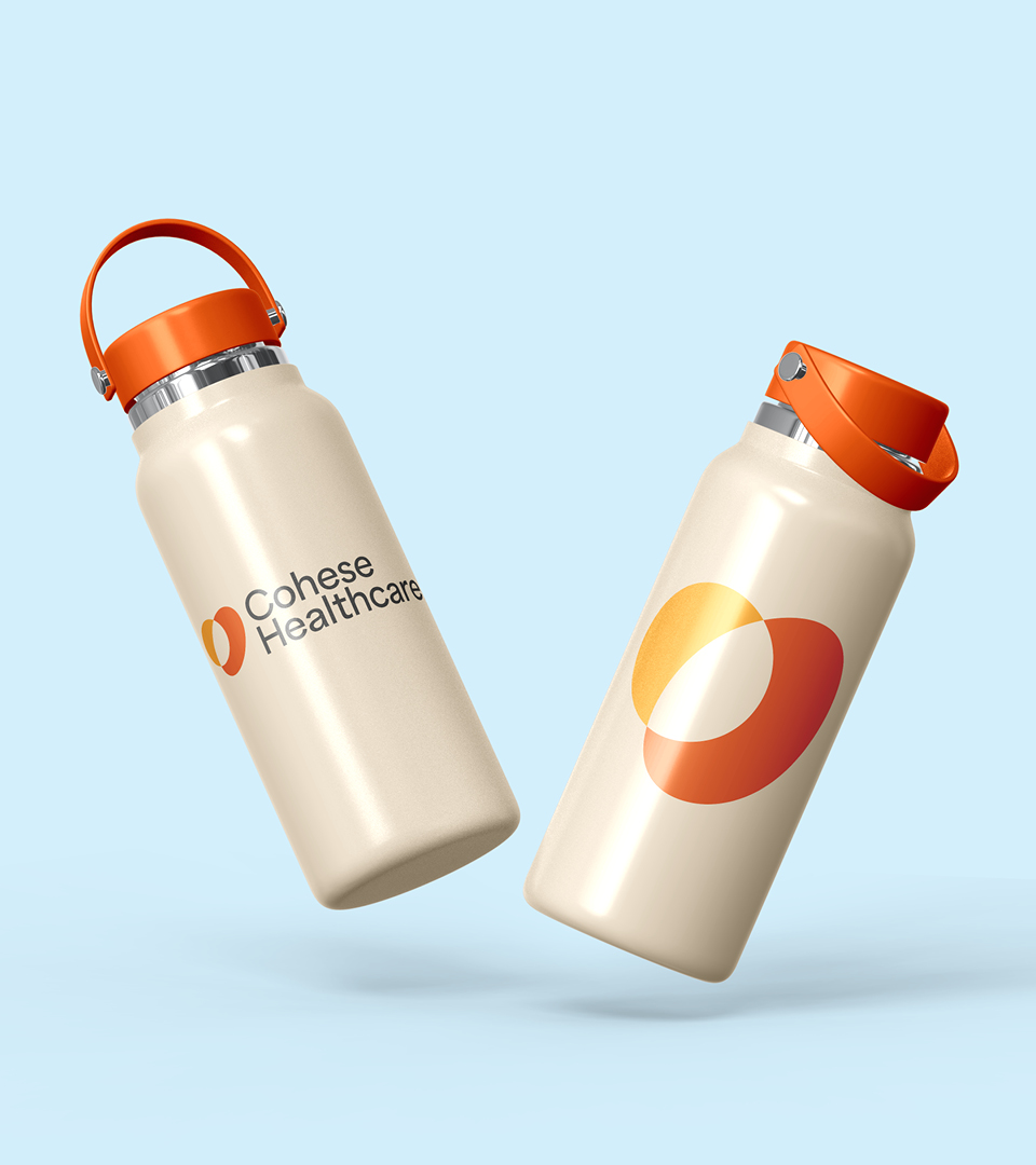
The new name, ‘Cohese’ – inspired by ‘cohesion’, reflects how the organisation delivers exceptional care and better outcomes through collaboration, while ‘Healthcare’ brings clarity to what they do. The brand mark, formed from two connected shapes, subtly echoes a heart, symbolising collaboration, co-creation, and care in action, capturing how Cohese Healthcare work together to deliver high-quality healthcare.
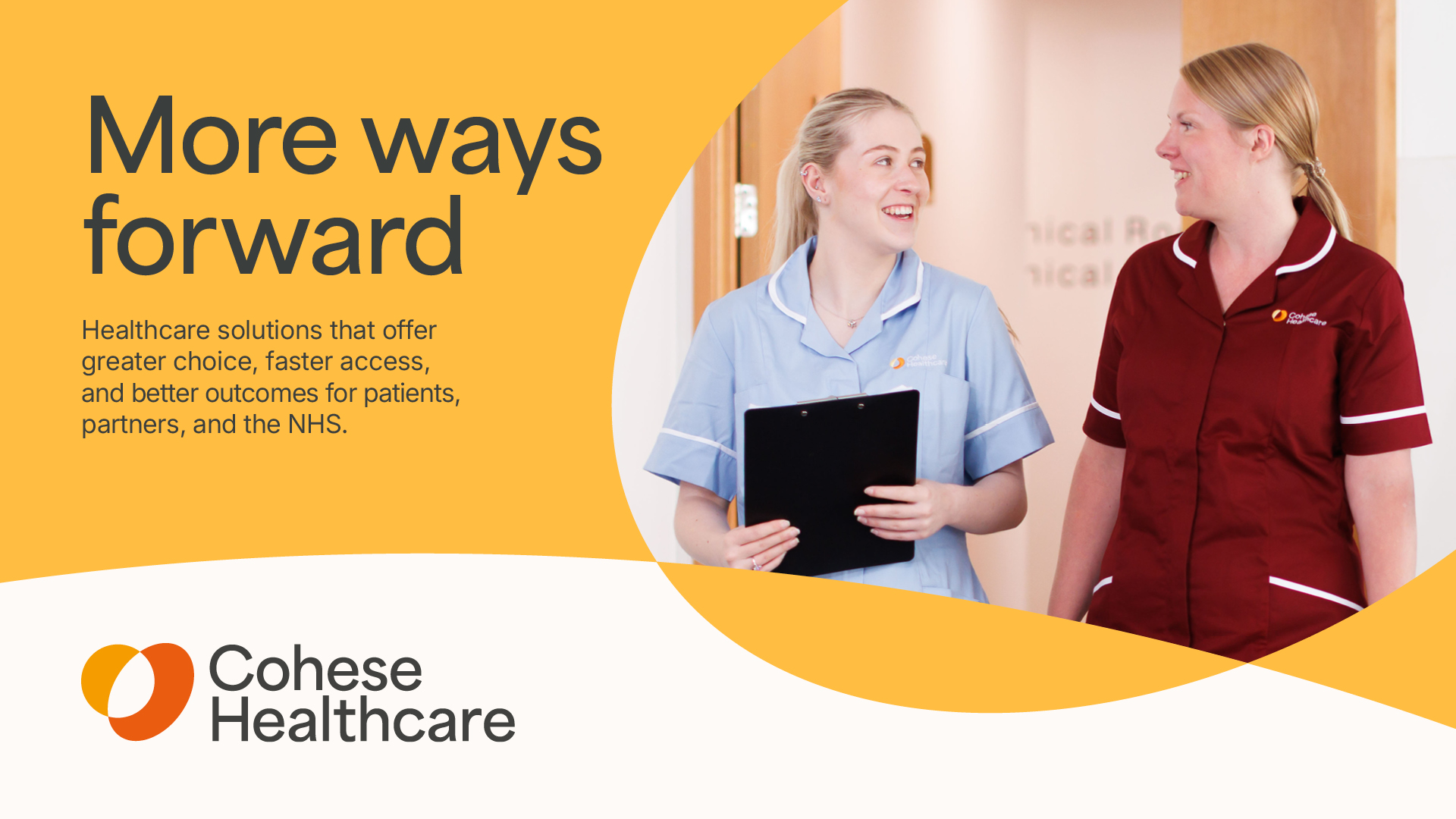
Shaping a purpose-driven Brand
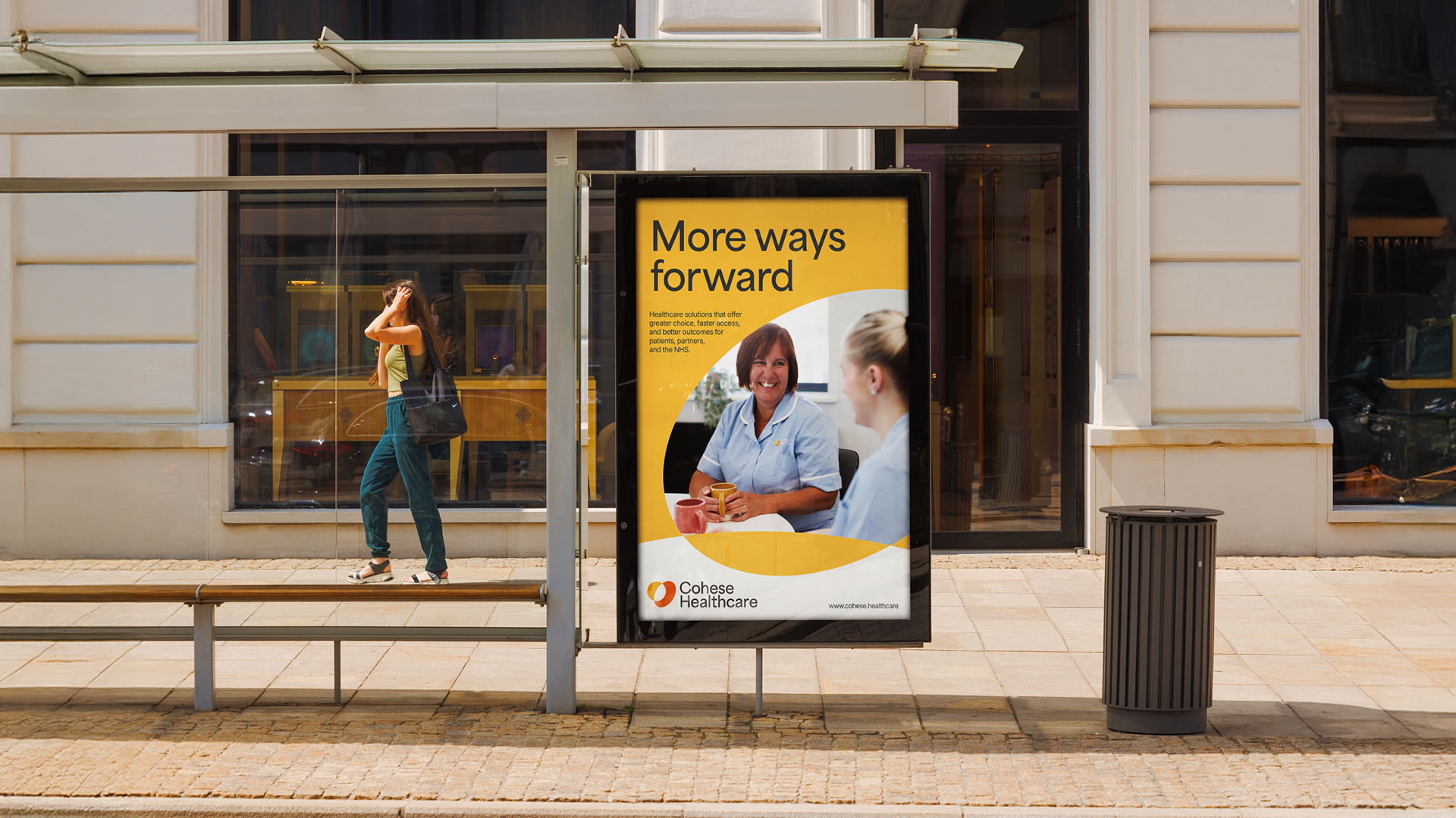
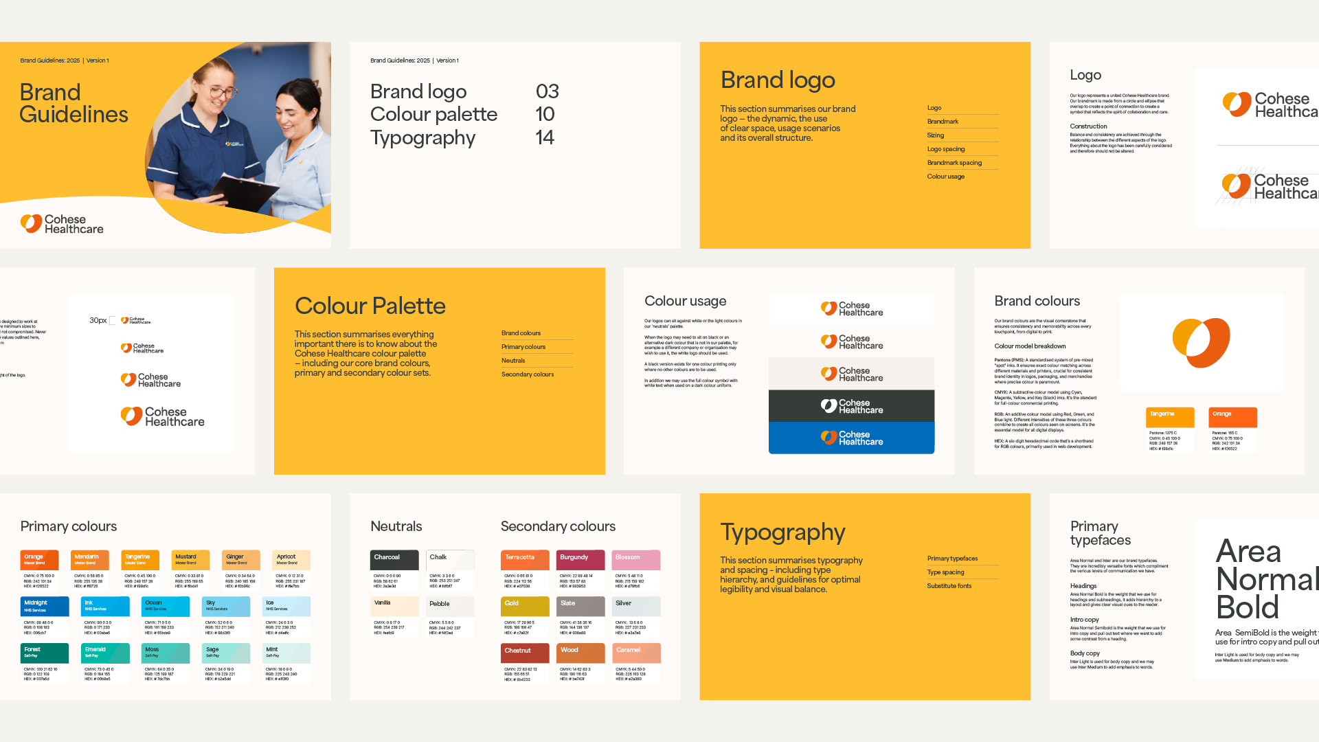
Through brand strategy workshops, we defined Cohese Healthcare’s purpose, values and key messaging, forming the foundation for their narrative and visual identity. The positioning and strapline, ‘More ways forward,’ communicates their commitment to creating streamlined pathways that deliver high-quality care and better outcomes – for every patient, in the right way, and the right place.

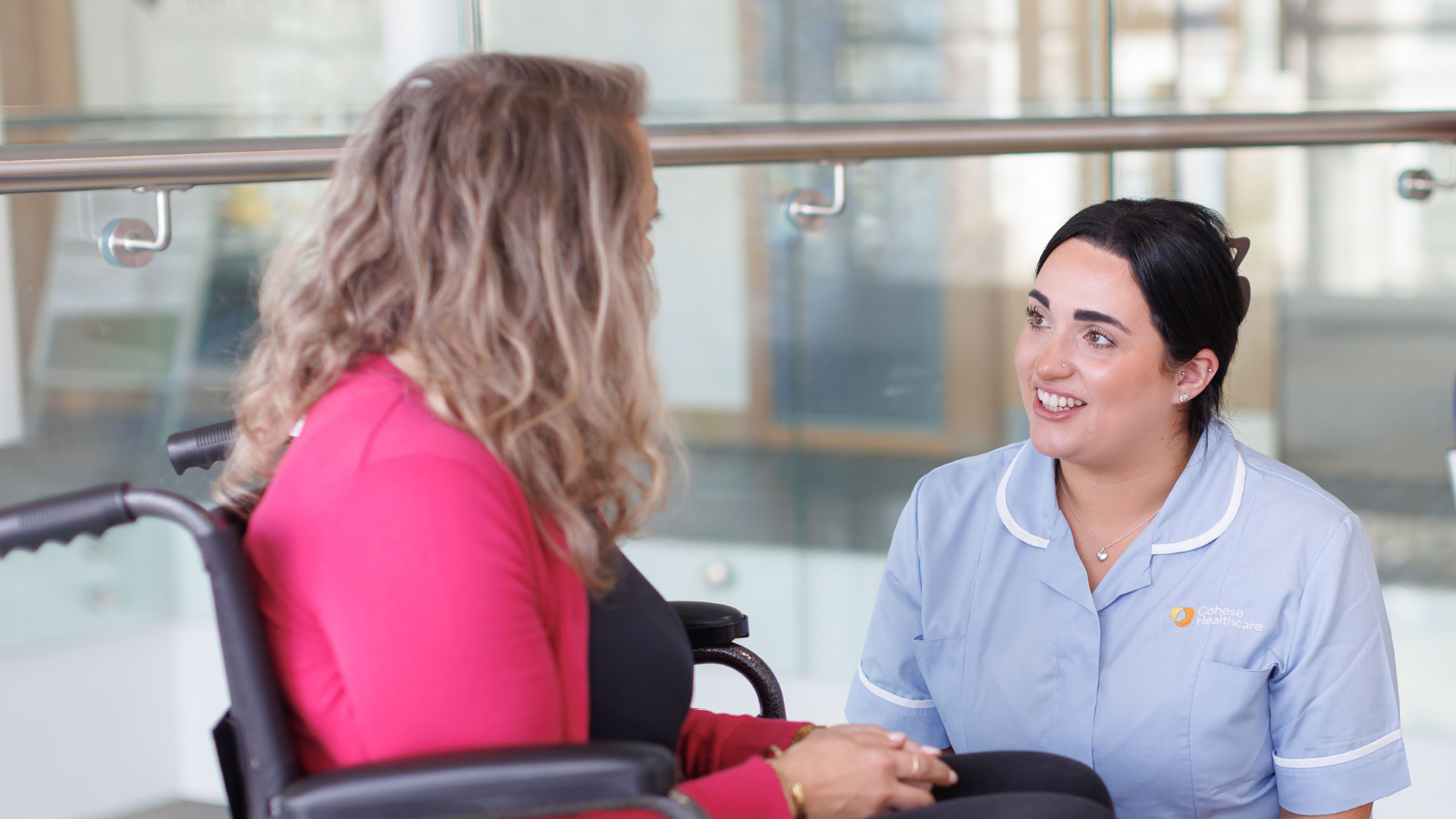
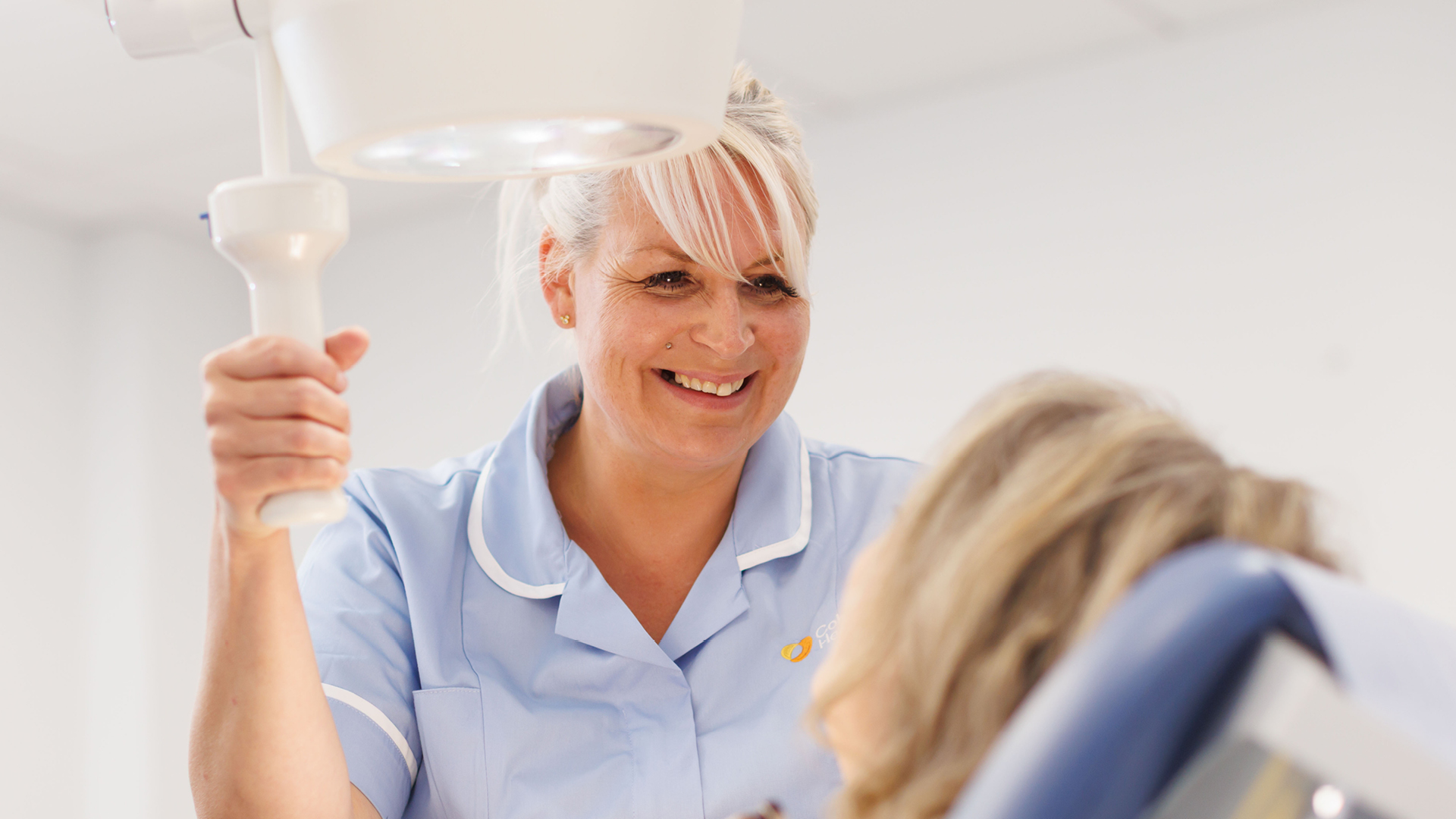
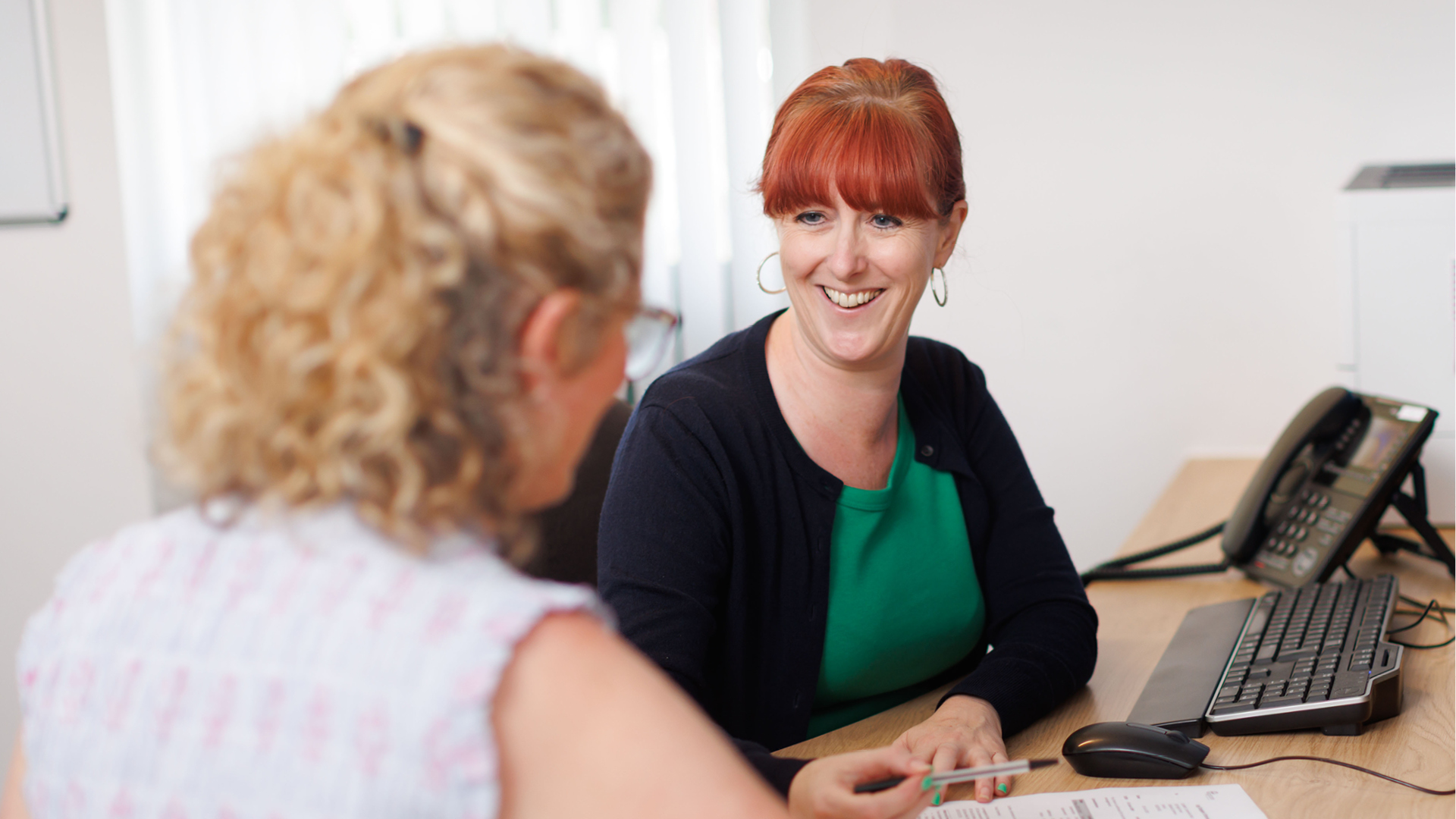
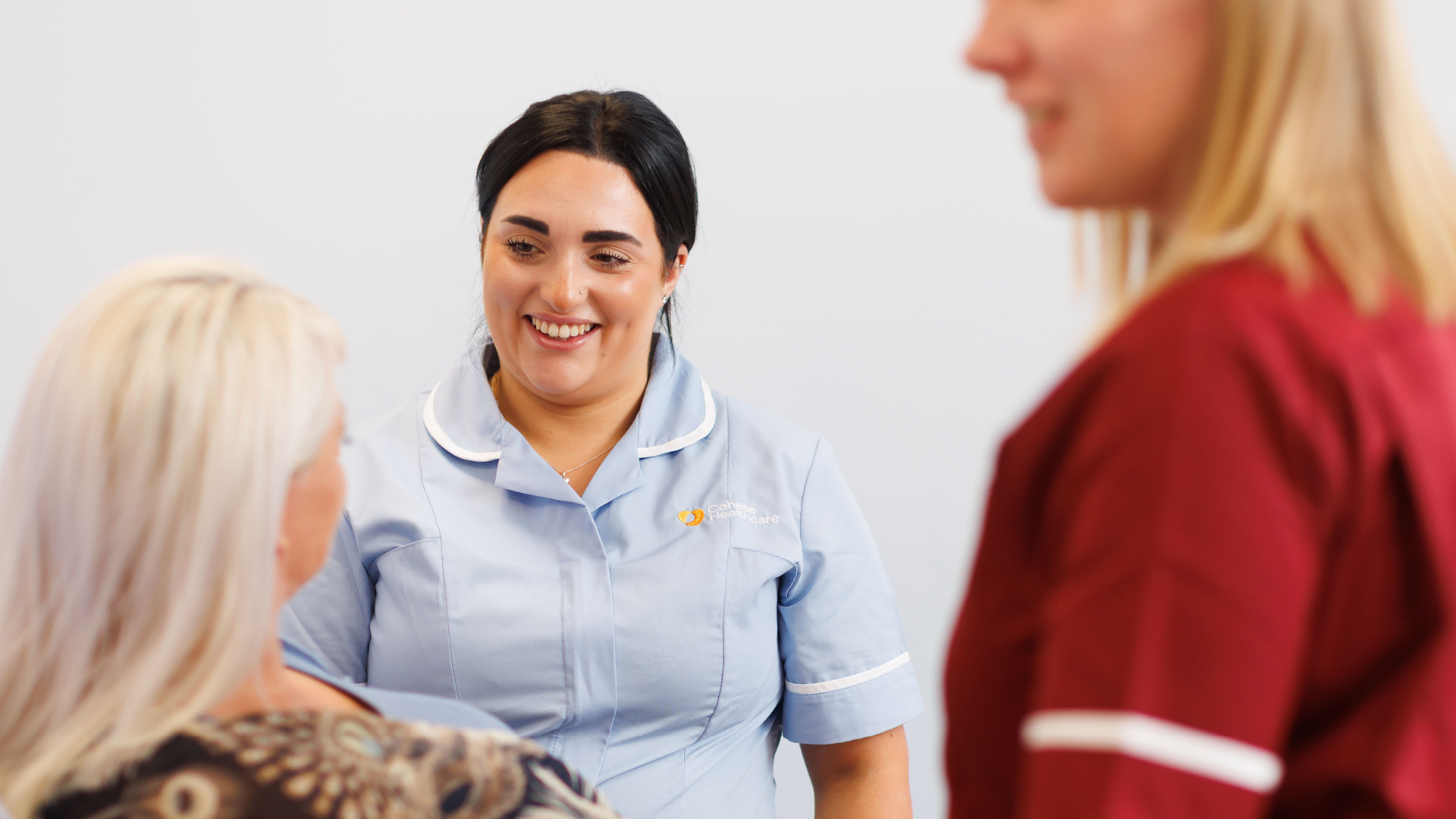
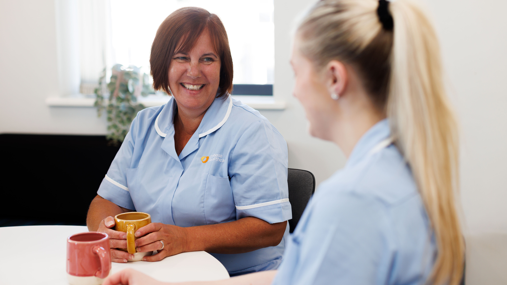
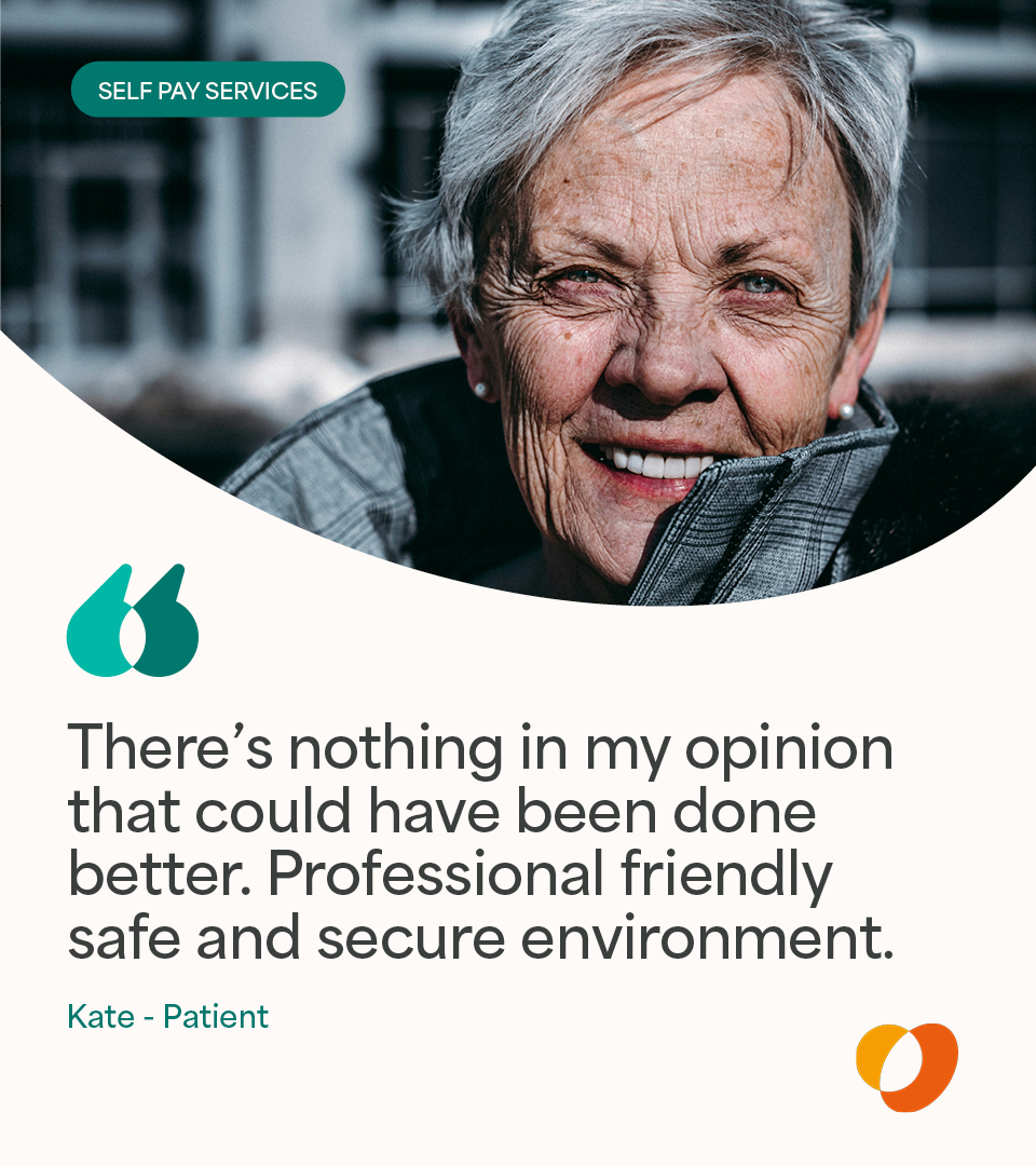
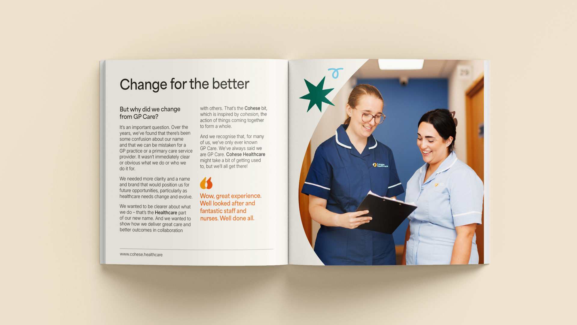
Capturing human connection
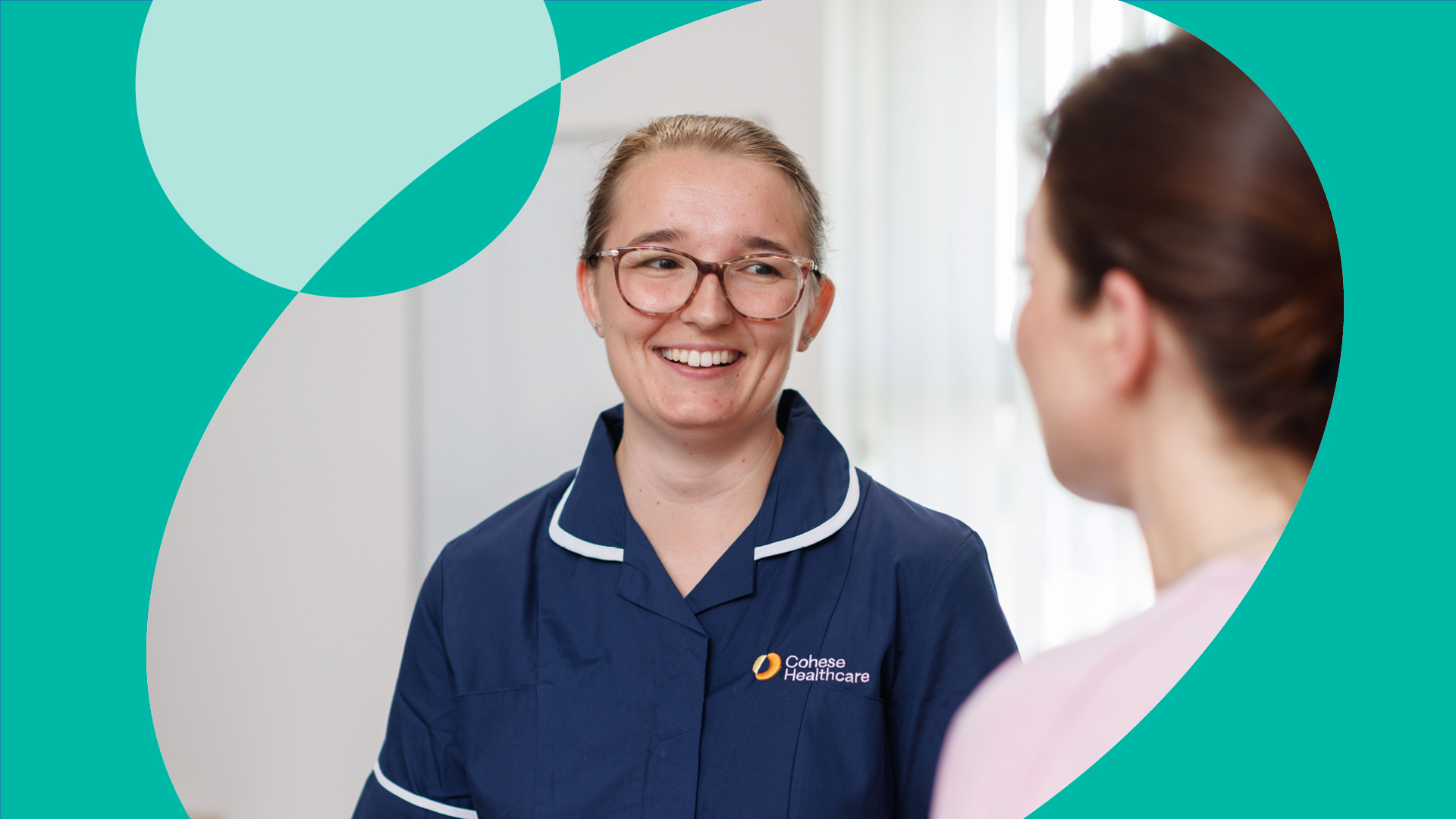
From the start, photography aimed to bring Cohese Healthcare’s story to life, capturing genuine connection, warm smiles, and authentic interactions. Each image reflects patients alongside clinicians, and clinicians working together, showcasing personality, collaboration, and the human side of healthcare in action.
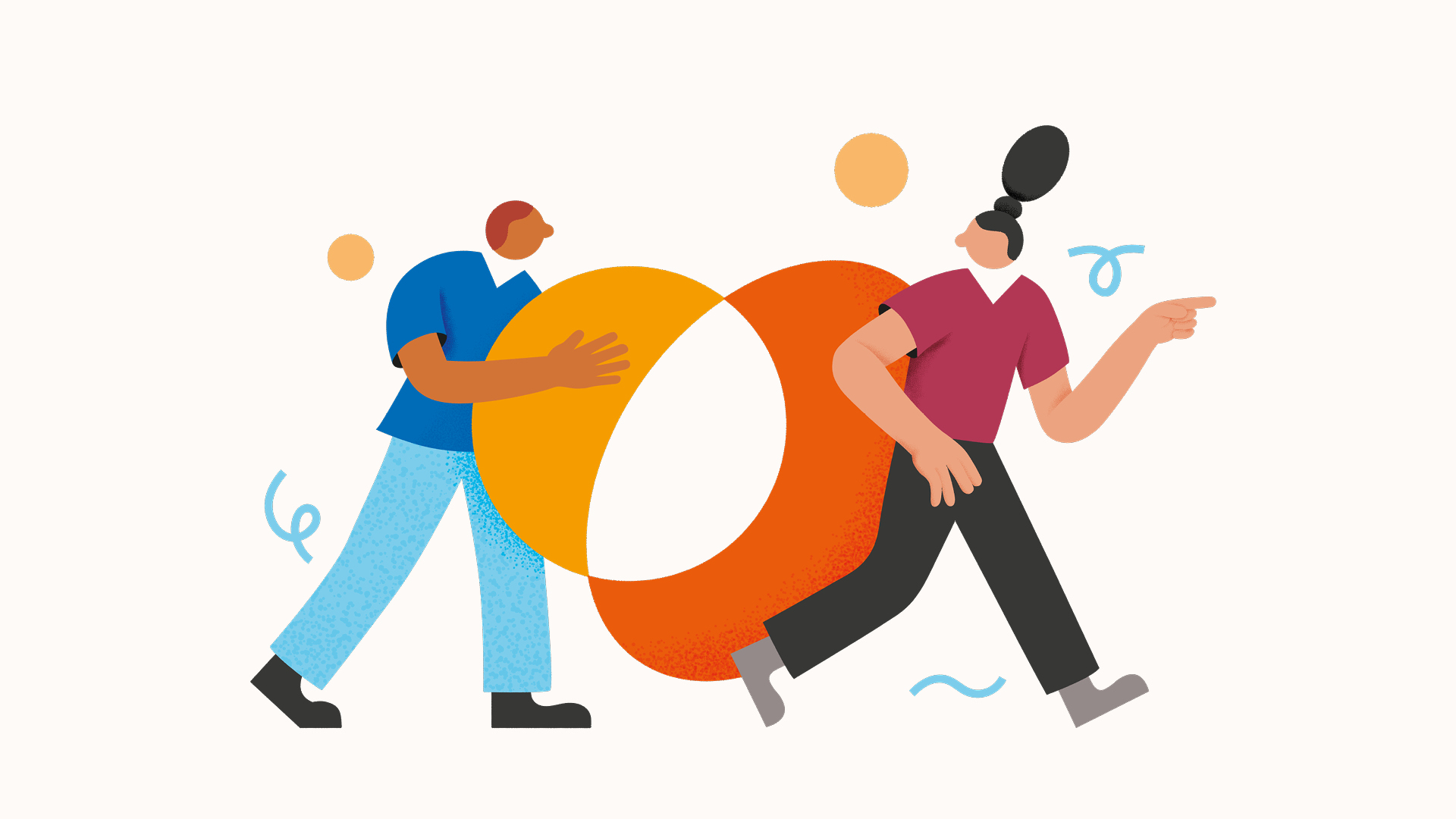
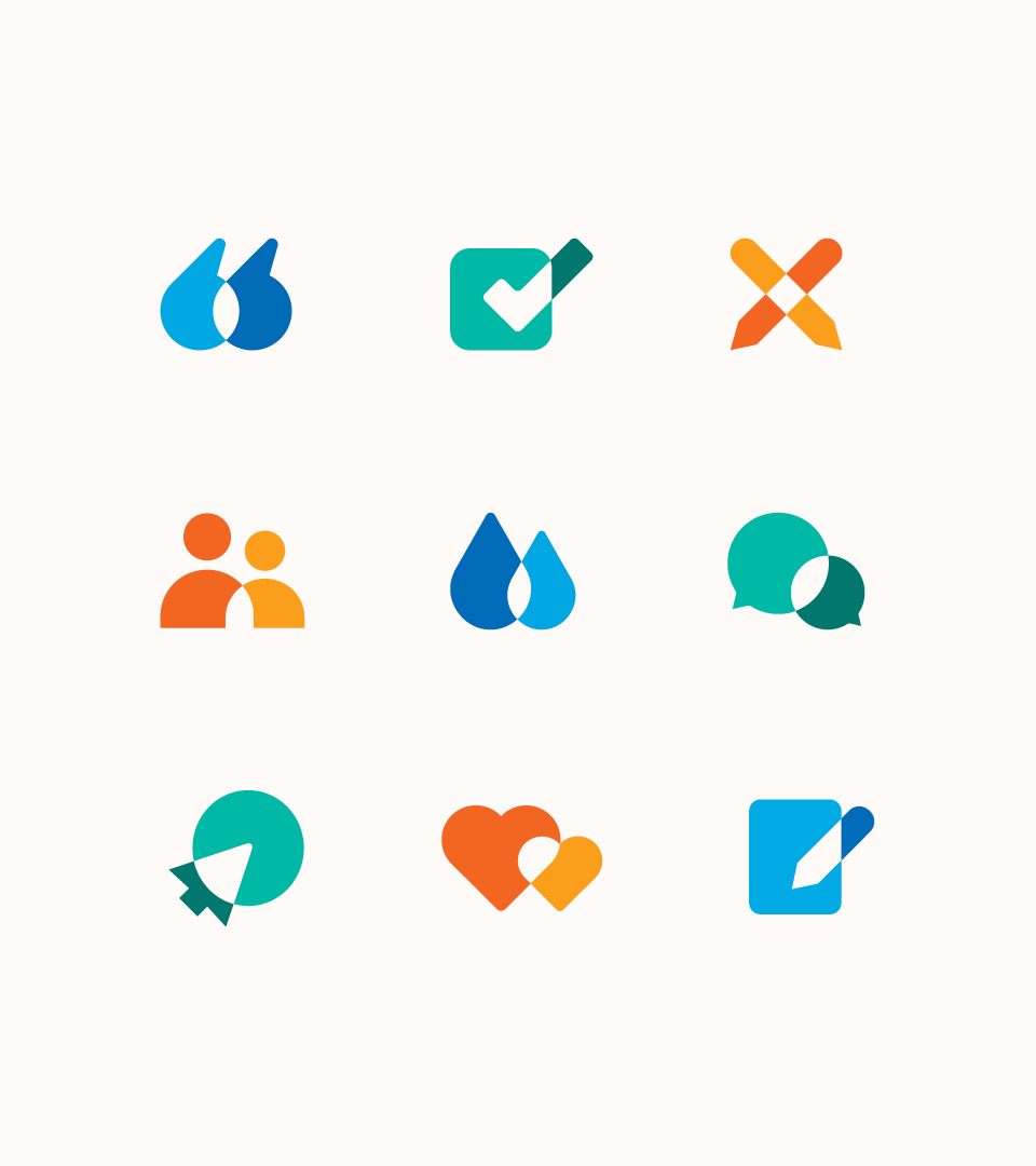
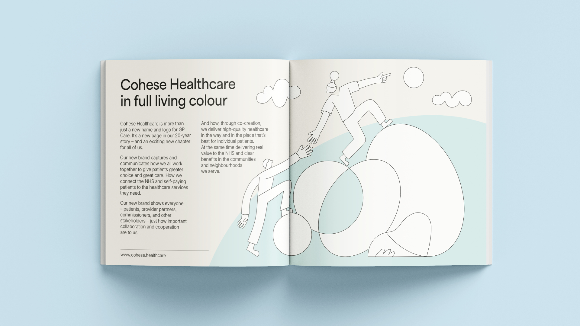
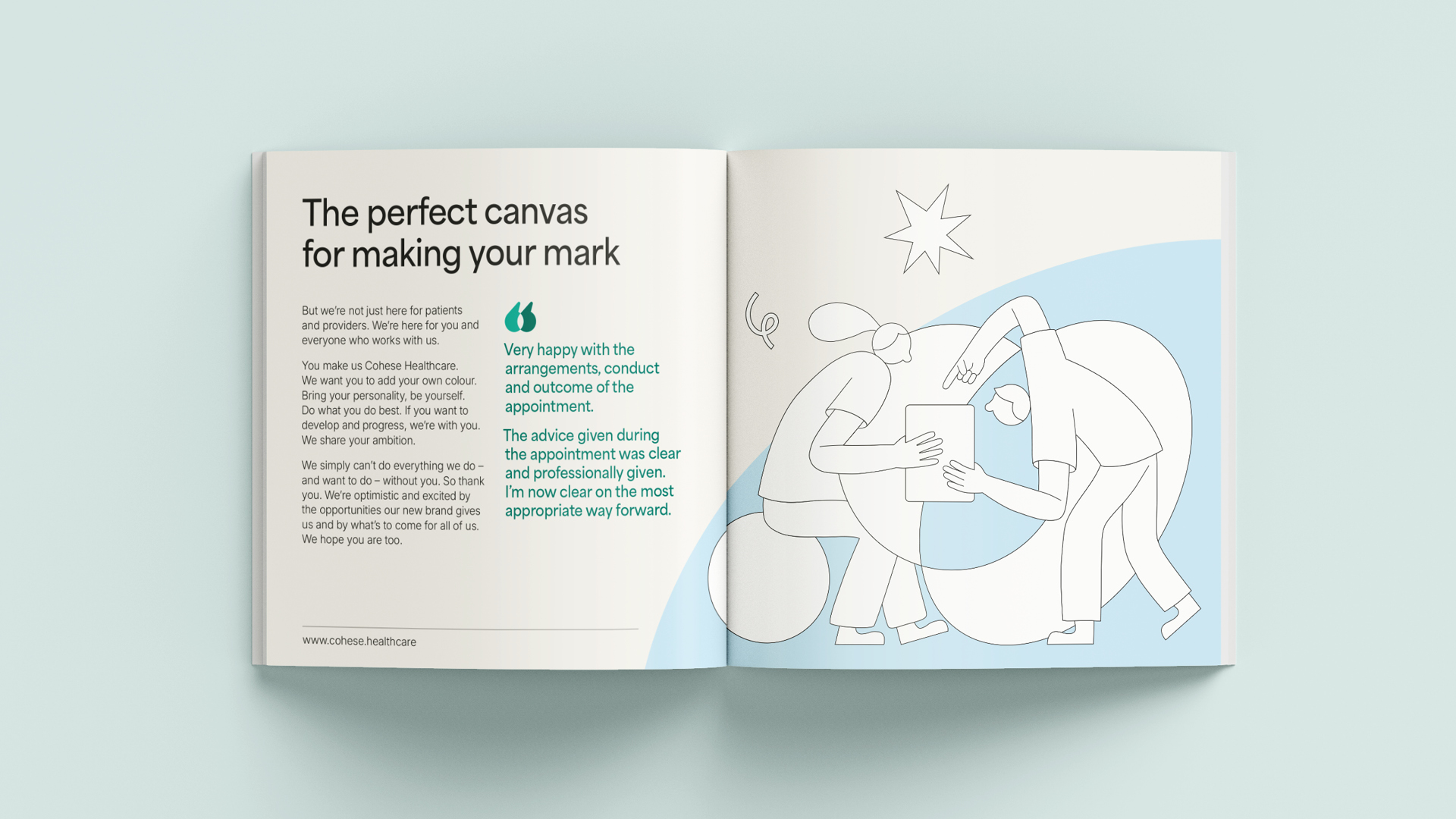
Storytelling through illustration
A suite of custom illustrations bring to life the brand’s friendly, collaborative personality while adding visual interest and energy. Integrated with the new identity, these illustrations communicate warmth, collaboration and care, helping the brand connect more deeply with its audience and reflect its human-centred approach.


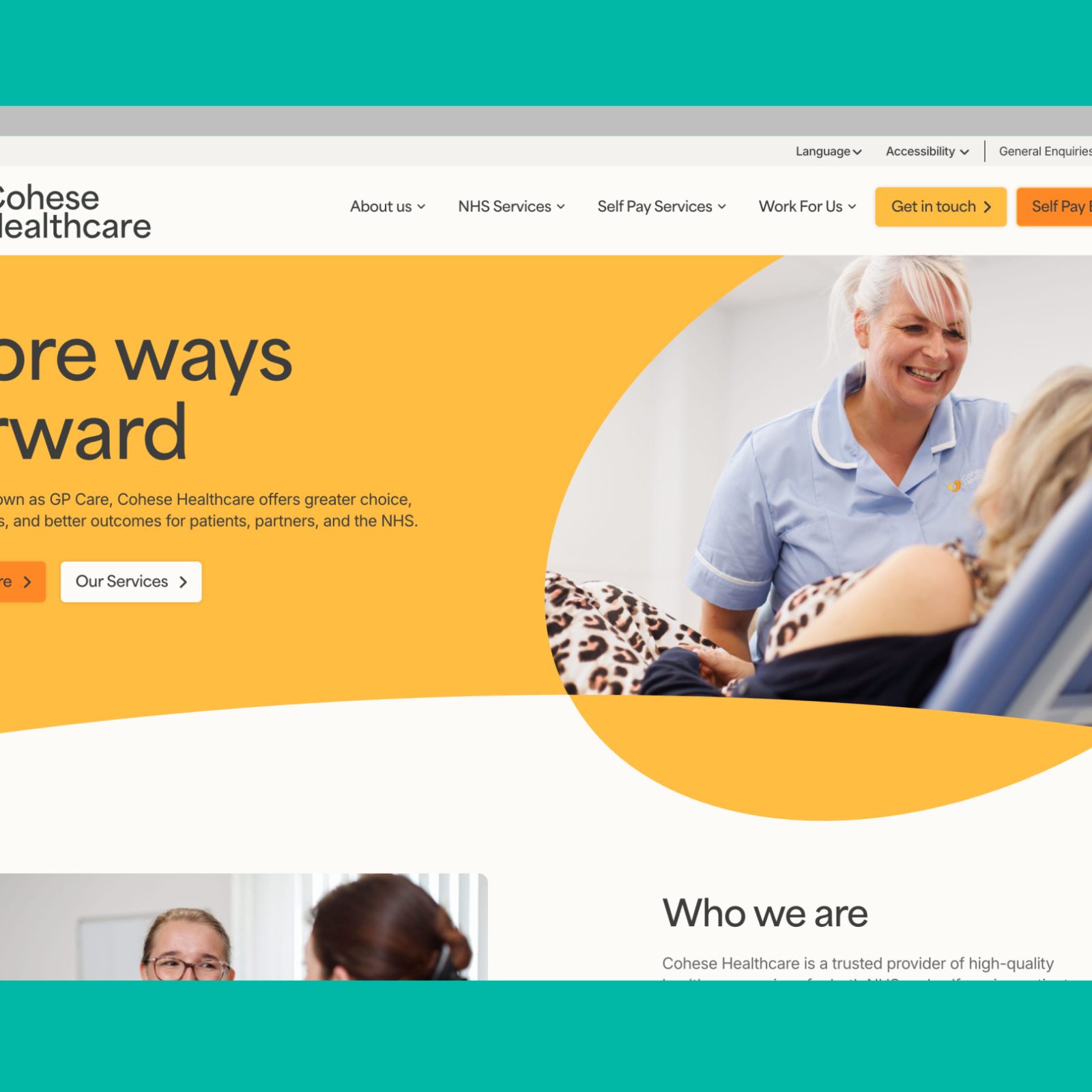
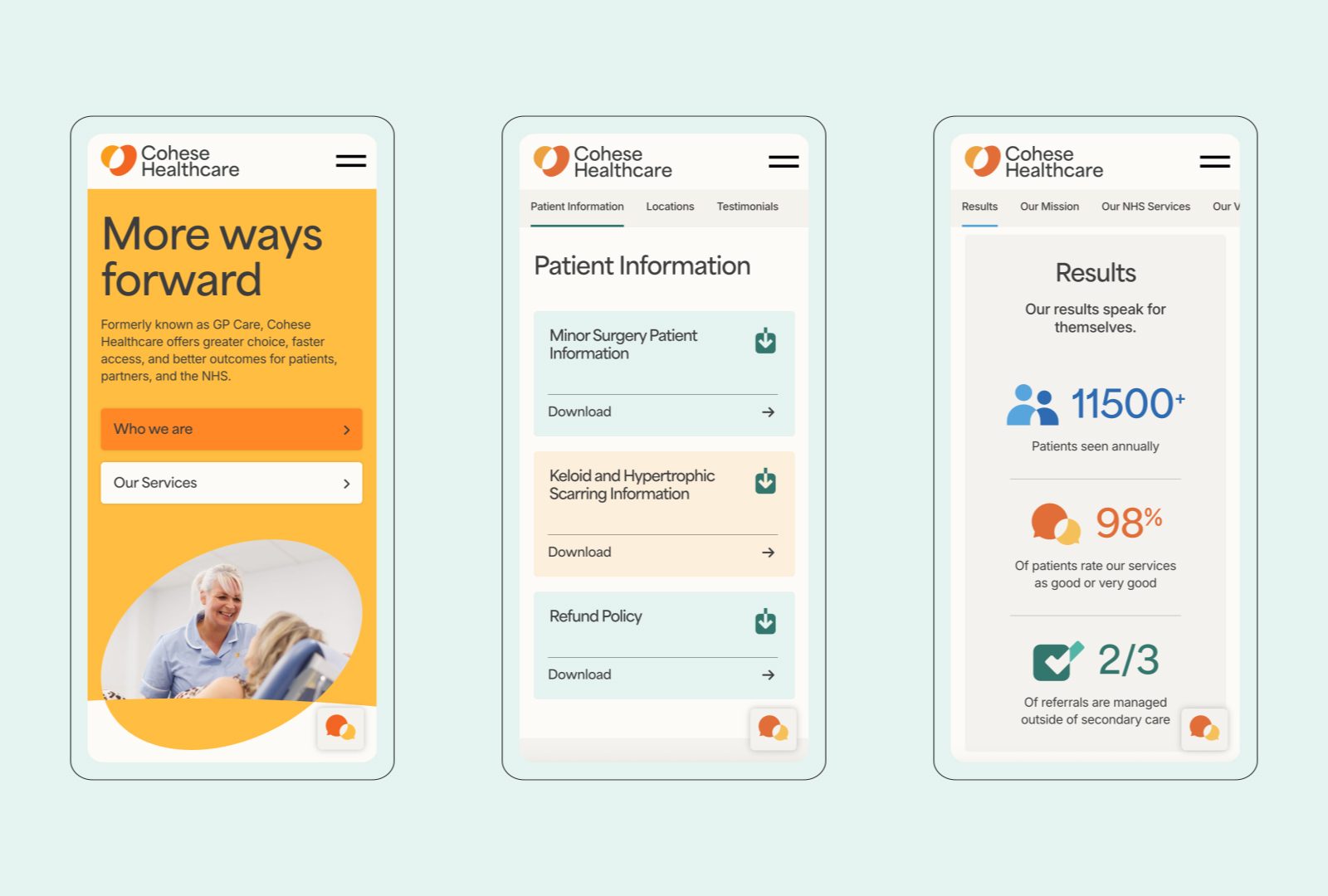
An accessible website built for growth
The new website reflects the brand’s visual identity through a clear, contemporary design shaped by audience insight. Accessibility and usability ensure patients, staff and partners can easily find and act on key information. Built on a modular WordPress platform, it offers flexible content management and seamless scalability as the organisation evolves.
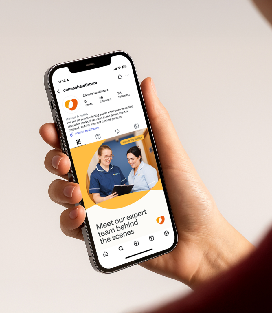
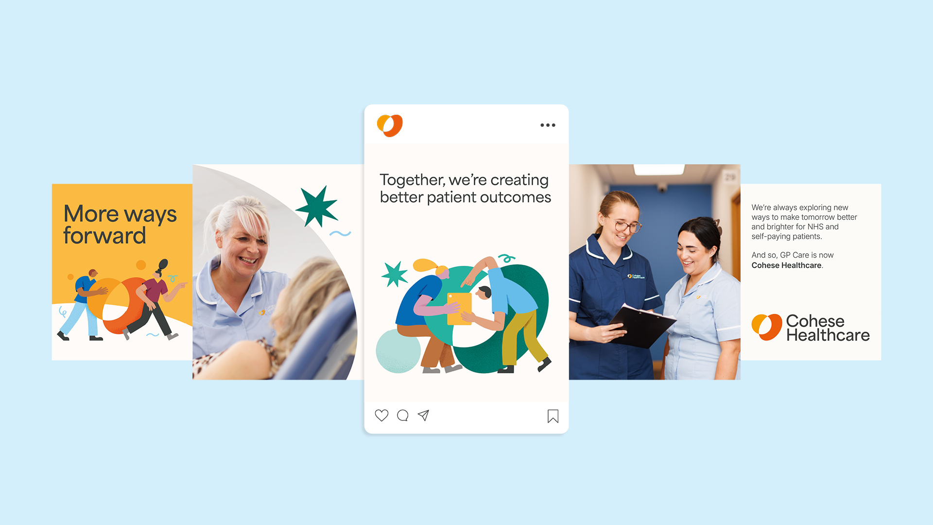
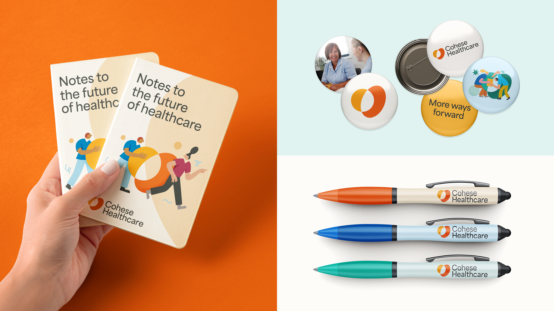
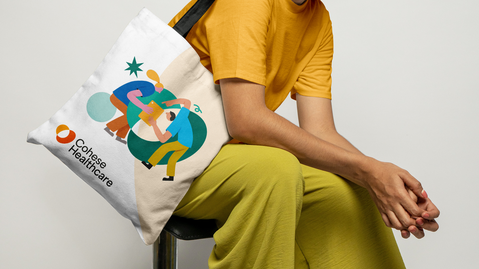
A creative and cohesive brand rollout
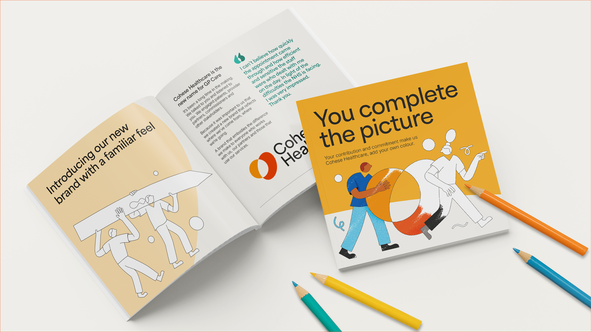
The new brand launched with a suite of print and digital templates, from social media assets to patient leaflets, designed to build awareness while conveying professionalism and trust. Uncoloured illustrations invite staff to add their own ‘colour’ to their brand books, transforming the rollout into an engaging celebration of creativity and teamwork.
More like this…


Ready to transform your brand?
Book a 15 minute discovery call with us and see how we can help you.
→